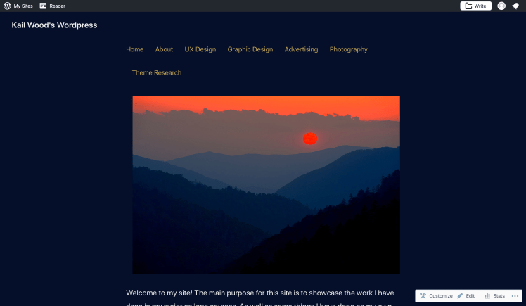
Home Page
Several of the technical components I changed about the home page were purely for aesthetic reasons. To start with the navigation, I thought having it across the top of the page would give users easy access to all the sites pages. As well as giving the first page users see a polished, professional feel to it. Users would naturally be sent back to the home page whenever they were done reading a page. So that being the page they would visit the most often made it the most visible and easily accessed place to put it. The next component of the home page I changed was putting the home page picture in between the navigation and the small paragraph about the site. Having the image on the home page right at users eye level makes the site as a whole feel much more inviting than putting it anywhere else.
Theme Research
I chose to put the theme research page under the about page because I felt it would have the best success there. Any page that is describing something about the site should without a doubt be found within the “about” section of the site. This was a no brainer. To see the decision making process I went through to pick this particular theme see the “theme research” page.
Slideshow
For the “Photography” section of the site I decided to put all the photos into a slideshow. The reason for doing so was because it was the best way to show multiple photos with as little space as possible. Having all the photos in the same place saves users time that they would otherwise be scrolling. If users had to scroll through the whole page looking at pictures they would eventually get bored and exit the particular page.
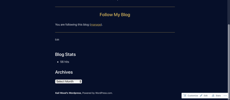
Widgets
While I did not put too many widgets in this site I believe the ones I did include are valuable to the site. The blog stats at the bottom of the page lets users see how the site is doing from a statistical point of view. This might encourage people to share the site. The Archives widget allows people to see when certain things were posted as well as the actual posts themselves. This is important for anyone who may want to see the progression of the site and its individual posts.
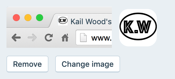
Site ID
I created my own site ID in Adobe Illustrator because I liked the idea of having one but not the idea of one I did not create. I thought having one would give the site a more professional feel which I believe it did.
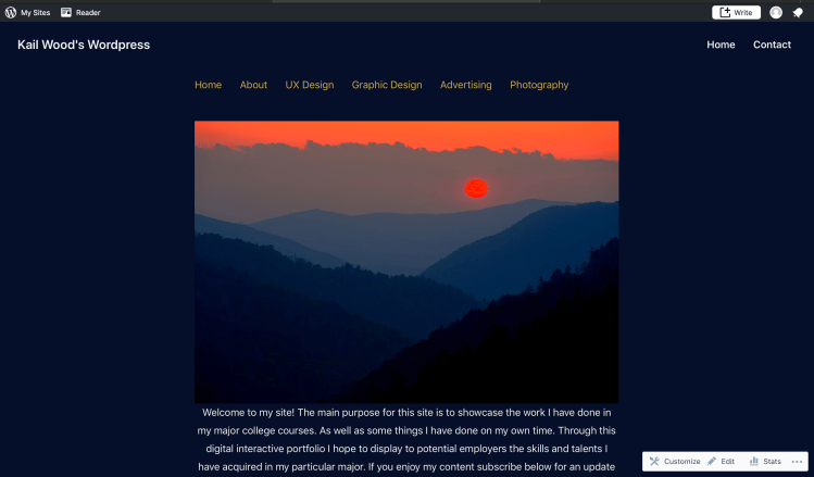
Menus
The menus that I added to the site are the two that I found most crucial to users experience. I added a home menu at the top of the site so that no matter where on the site users end up they will always be able to get back to the home page. I also added a contact menu bar at the top of the site because a huge part of this site is trying to get in contact with potential employers. So having the sites contact page in clear site while on every page is very beneficial.