Below is an ordered list of the themes I considered using for this site.
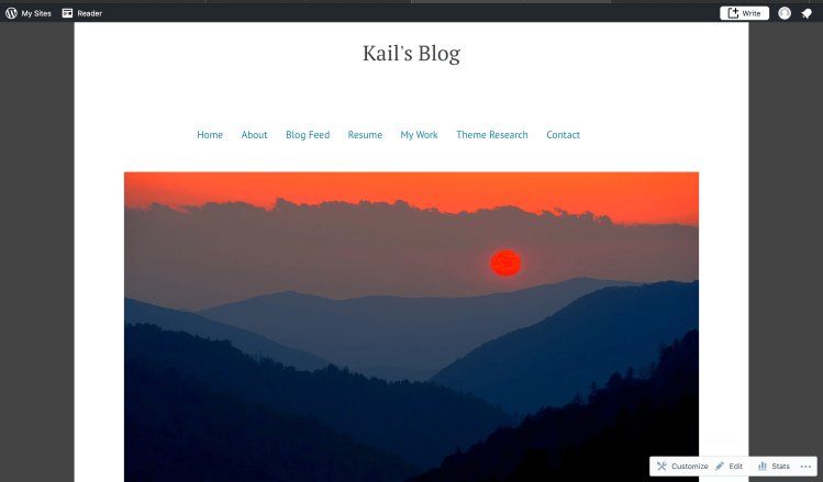
#1: Rivington
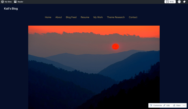
This theme makes the most sense to use for this site. Thoughtfully incorporating both professionalism and aesthetic into the design. It easily attracts the eye and makes the page content pop while not being too noisy. The overall aesthetic is simple yet effective. This theme does not require users to think at all, it is right to the point. Which will allow users to have the best experience. The color combination also works perfectly with the image on my homepage. The only con I can find about this theme is that some media elements may not go with the color scheme. This could potentially take away from the overall aesthetic of the design/theme.
#2: Brompton
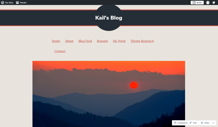
This theme definitely stands out from most of the others and has great potential to be used for my site. One of the biggest pros about this theme is the overall setup of it. The bar at the top with the site title in a circle gives it a nice, clean professional look. The overall aesthetic is both professional and casual at the same time which is perfect for this site. The color scheme also works very well with the image I used on my homepage. One con I found about this theme is that it may look a little too casual to any potential employers visiting the page. Another con is that the bar at the top only looks good on the homepage, on the other pages it is very noisy and disrupts the overall aesthetic of the site.
#3: Morden
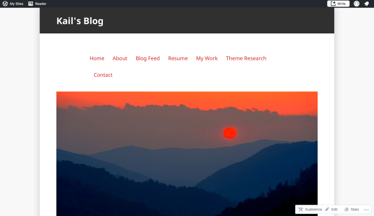
There are a lot of upsides to this particular theme but also several downsides. To start with the upsides, this theme has a sleek, mordern look to it. Another pro is that it looks very professional which is great for potential employers who visit. On the other hand, the overall aesthetic is not eyecatching and does not make the content pop. This con alone is a good reason to use another, more visually stimulating, theme.
#4: Barnsbury
This theme works well for with what this blog is used for. One huge pro is how simple it is, making it easy for users to navigate. This design is nice because it does not make users think much about what to do or where to go. The features that are most useful to me would have to be the easy navigation and easy-on-the-eyes design. Really the only cons to this design is that it doesn’t really grab the attention of viewers. It is somewhat bland and dull, and does not have a lot of flare to it.
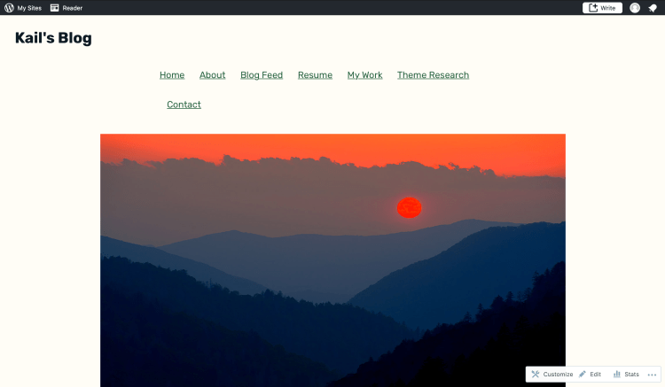
#5: Shawburn
This theme has the potential to work well with my blog/site. It is simple and to the point which makes it easy on users. The design has a sleek, professional look to it which is great for any potential employers who see it. One downside I found to this theme is that it may be a little too simple. While simplicity is good for this kind of site if it is too simple it may come off as dull and make people exit it.
Rationale of choice
I chose Rivington as the theme for this site for many reasons but the most important was its overall aesthetic. Out of the five themes I decided on it simply it just looked the best. It is simple, easy to navigate, professional, and looks good on every page. When I first put the theme on my site I was shocked by how great it looked so I figured that was a good way to decide on it.
